
I’ve been writing again. After nearly four years of letting my website collect digital dust—publishing only a few posts while my day job consumed all my creative energy. I finally felt the itch to both write and fix the stagnant site that housed my thoughts.
The site functioned—posts appeared, links worked, the basics held together. But navigating it was like searching through a poorly organized filing cabinet. I had scattered tags on posts but had no way to browse by topic. No tag pages, no meaningful organization, no help for anyone trying to find related content. For someone who spends their days thinking about user experience, this was painfully ironic. You know the old saying about the cobbler’s children having no shoes? I was living it. Here I was, making shoes all day for everyone else, while my own website felt like it was designed by someone who’d never heard of information architecture.
Starting with the Obvious Problems
My first instinct was straightforward: build a tag page so people could actually browse content by topic. Easy enough, right?
Except it wasn’t. My site was running on the original jekyll-paginate plugin, which hadn’t been updated in years and was basically deprecated. No tag support. No modern pagination features. Just the bare minimum functionality from Jekyll’s early days.
Fine. Time for an upgrade.
Down the Rabbit Hole
What I thought would be a quick afternoon project turned into a complete overhaul. Migrating from jekyll-paginate to jekyll-paginate-v2 meant rewriting pagination templates, updating configurations, updating my github actions to build the site from source, and learning a whole new set of features I didn’t know I needed.
But the new plugin was powerful. Automatic tag page generation. Better pagination controls. Support for filtering and categorization that actually worked. I spent an evening reading through the documentation, feeling that familiar excitement when you discover a tool that can do way more than you initially expected.
I got the basic implementation working (eventually). Tag pages generated automatically. Each post linked to its relevant topics. Everything functioned exactly as intended.
And it was completely uninspiring.
The Boring Solution
I had what every blog is supposed to have: a tag cloud in the sidebar, individual tag pages with post listings, the whole conventional setup. Visitors could click on “Product Strategy” and see my three posts about product strategy. Mission accomplished.
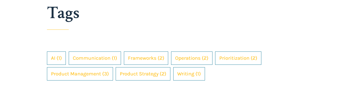
But looking at my homepage, something felt off. I’d written the hero section to introduce me. Then, completely disconnected, there was a generic “Browse by Topic” section with a list of categories that told you nothing about what I actually cared about.
The tags themselves were part of the problem: “Book Review,” “UX,” “Tips,” “Innovation.” Technically accurate. Utterly forgettable. They read like someone else’s filing system, not an invitation to explore ideas.
Searching for Something Better
I started experimenting. What if the tags weren’t separate from the introduction but part of it? What if instead of listing categories, I could weave them into the story of what I write about?
This led me down a path of consolidating and rethinking. Instead of a dozen scattered tags, I grouped everything into seven thematic areas that actually represented my interests:
- Product and Strategy - but not just that. “Product strategy and what makes technology feel inevitable.”
- Leadership and Culture - again, with context. “Building teams that deliver meaningful outcomes.”
Each category needed to justify its existence not just as organization but as positioning. What was my angle? Why should someone care about my take on this topic?
The Breakthrough
The real shift happened when I stopped thinking about tags as metadata and started thinking about them as storytelling.
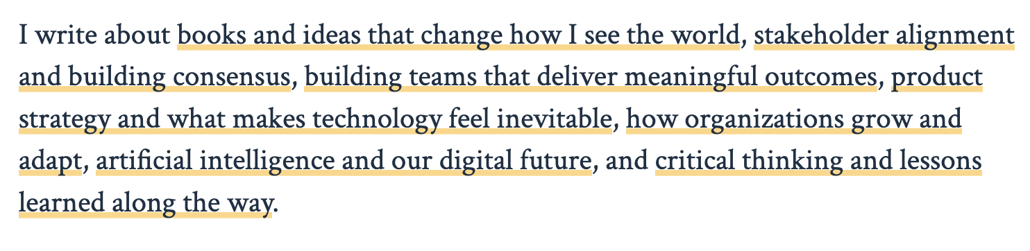
What if my introduction flowed directly into what I write about? “Hello, I’m Craig McCaskill. I write about [tags flowing as a natural sentence].”
Suddenly, navigation became narrative. Instead of forcing people to decode a list of categories, I could show them exactly what they’d find and why it might matter to them.
Making It Work
The technical implementation was surprisingly straightforward once I had the concept clear. Jekyll’s Liquid templating let me store tag descriptions in my site configuration and loop through them with proper punctuation—commas between items, “and” before the last one, period at the end.
hero_topics:
  - tag: "Product and Strategy"
    description: "product strategy and what makes technology feel inevitable"
  - tag: "Leadership and Culture"
    description: "building teams that deliver meaningful outcomes"
  # etc.
Then template logic to turn that data into flowing prose. The result reads like a conversation, not a database query.
<div class="hero-topics">
    <p class="hero-topics-text">
        I write about
        {% assign sorted_tags = site.tags | sort %}
        {% for tag in sorted_tags %}
            {% assign tag_name = tag[0] %}
            {% assign tag_posts = tag[1] %}
            {% assign display_text = tag_name | downcase %}

            {% for topic in site.hero_topics %}
                {% if topic.tag == tag_name %}
                    {% assign display_text = topic.description %}
                    {% break %}
                {% endif %}
            {% endfor %}

            <a href="/{{ tag_name | slugify }}/" class="hero-topic-link" title="{{ tag_posts.size }} post{% if tag_posts.size != 1 %}s{% endif %}">{{ display_text }}</a>{% if forloop.last %}.{% elsif forloop.rindex == 2 %}, and {% else %}, {% endif %}
        {% endfor %}
    </p>
</div>
The homepage dynamically generates a sentence listing all the topics I write about, with each topic as a clickable link. Here’s how the code works:
The homepage uses a Jekyll template that automatically builds this sentence from the blog’s content. It loops through all tags that have been used in posts, replaces each tag name with a reader-friendly description (defined in the site configuration), and assembles them into a grammatically correct sentence. For example, if the blog has posts tagged with “Product and Strategy,” “Leadership and Culture,” and “Technology and Future,” the code generates
“I write about product strategy and what makes technology feel inevitable, leadership and building teams that deliver meaningful outcomes, and artificial intelligence and our digital future.”
Each topic phrase becomes a clickable link to that tag’s archive page, making it easy for readers to explore specific areas of interest. The code handles all the formatting details—adding commas between items, inserting “and” before the last item, and ending with a period. It even includes a hover tooltip showing how many posts are available for each topic.
This keeps the homepage fresh and accurate as new topics are added or post counts change, while maintaining a natural, readable presentation that immediately tells visitors what to expect from the blog.
Then slap some css on those elements and the final result reads like a conversation, not a database query.
What I Learned
This wasn’t really about Jekyll plugins or Liquid templating. It was about questioning a fundamental assumption I’d inherited without thinking: that website navigation should be administrative rather than experiential.
The breakthrough came when I stopped asking “how do I organize my content?” and started asking “how do I help someone understand what I care about?” That shift—from categorization to communication—changed everything. Suddenly, my navigation wasn’t just functional; it was doing the work of positioning and storytelling.
Your website isn’t a content management system. It’s a first impression, a positioning statement, an invitation to engage with ideas that matter to you. Every element should serve that purpose, even the mundane.
Beyond My Website
Working through this reminded me why I enjoy product work. There’s something satisfying about taking a functional but uninspiring experience and finding the human insight that makes it better. The technical implementation is usually the easy part (even if it has been over a decade since I’ve written any production code). The hard part is stepping back from conventional solutions and asking what would actually serve your users.
In this case, visitors to my site were people wondering whether my writing might be worth their time. A boring tag cloud answers that question poorly. A clear statement about what I care about and why—woven seamlessly into my introduction—answers it much better.
Now when someone lands on my site, they immediately understand what they’ll find and whether it aligns with their interests. The navigation tells a story instead of presenting a puzzle.
And honestly? It makes me want to write more, knowing that people can actually discover what I’m thinking about. Sometimes the best way to solve a content problem is to fix the content experience.